But hopefully the outcome is a crisper, clearer look, which better fits in with the corporate style that has evolved over the last year. In the early part of 2009 we were concerned that our corporate identity was a bit of a mess. Our starting point was a livery and logo designed for us in the early days by Ray Stenning of Best Impressions, a well-known industry figurehead.
I have worked with Ray on a variety of projects over the last ten years or so and he has always been inspirational to work with, and his design contribution to getting us off the ground will never be forgotten. Thanks to Ray, we started life with a quality of design and livery of which most small start-up companies hardly dream!
However, circumstances dictated that we could not work with Ray on an ongoing basis, and we sourced our publicity, stationery, internal communications and other corporate paraphernalia without any real co-ordination from a variety of sources - some internal, some external (including our friends at PB Bus Marketing)
The result was that nothing looked quite the same. Some stuff looked very professional, others less so. The logo appeared with subtle variations all over the place, including the "smooth operator" strapline in some instances but not in others, and in a variety of positions and typefaces where it was used.
However, this kind of approach is anathema to me. I am a firm believer in a very strong and well-managed brand and corporate identity. One's brand communicates so much about the values and professionalism of the company, and a good brand has to be both reassuring to existing users and also enticing and attractive to potential new users.
There are miserable people out there who think it doesn't matter what colour the bus may be, or whether the fleet name or logo are the correct colour or typeface, as long as the bus turns up, because apparently they think that's all people care about. Well, at the point of wanting to get home from work that may well be all they care about. But when they made the decision that they wanted to use the bus in the first place, that decision will have been influenced, to a greater or lesser extent, by the company's brand. You haven't a hope of growing your business if no-one knows what you look like!
Imagine walking into a supermarket and seeing all the products in identical white boxes, with the name of the product written in black block capitals on the side. Apart from being very boring, it would be a very tedious and time consuming business trying to find all the products you wanted to buy, and you certainly wouldn't be encouraged to try anything new. From a functional point of view, you could achieve shopping ("it doesn't matter what colour the bus is....") but you wouldn't be in any hurry to go back!
Our position at that time was driven by necessity rather than desire, with the priority being on setting up a viable company with minimal cash outlay. Once we reached a point in spring 2009 - eighteen months after we were born - where we found some time to stop and reflect, and a small amount of cash to set aside, we decided to bring the situation under control.
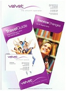
Acting on a recommendation we turned to a London agency, Martyn Cornwall Design, and gave them the brief to develop a proper corporate identity. Having reviewed all the various manifestations of our identity, they quickly developed a style that we liked. They tweaked the logo very slightly, making it a little bit sharper and crisper, and developed a 'house style' for corporate stationery, publicity and such like. When the Solos arrived in the fleet in early 2010 they updated the livery and also applied this style to the recently acquired Dart SLF, and this has been very well received.

The one area where we had never really got to grips with the corporate identity was on our website. In order to save money at the outset, I decided that I would do the website myself! After all, I could do great things in BBC Basic on my Mum's BBC 'B' Microcomputer (32K, don't you know) back in the early '80s - I just needed to brush up my programming skills a bit!
So I bought some books and taught myself to programme some HTML, and coded our first ever website using the skills I'd taught myself. And here it is! In actual fact, I've kept our entire archive of websites in our very own web 'museum', so you can actually go and see it for real here if you want!
As you can see, that was a pretty basic attempt at a website, just announcing that we would soon exist! Then I managed to progress a few more chapters through the book and decided to try my hand at animation! The next iteration therefore involved both sound and animation, with a little picture of 309 trundling across the page! It looked fairly naff at the time, absolutely horrific with hindsight, but if you want to see 309 moving for real (and if you have the correct plug-in you might even hear some music), here it is!
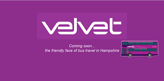
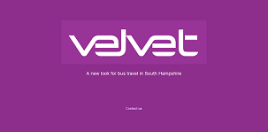
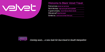
At that time things were hotting up and we weren't far from starting our services, so I turned my attention to developing a 'real' website with actual information that would be useful to people. My first attempt is shown below. At that stage we were still using our full name, Black Velvet Travel, and felt that a black background would suit the image. This was also evident from our early timetable leaflets. Anyway, I abandoned this design of website pretty quickly because I just thought it looked rubbish, so it has never been seen in public before, but if you want to see how far I got, help yourself!
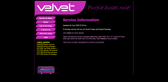
Finally we hit upon a design we liked, and by this stage I was romping through the html textbook, and was even playing with a bit of Javascript (mainly on the 'meet the team' page) and I think there's even some PHP in there somewhere! With various tweaks along the way, this website survived over a year so will be familiar to anyone who was following us in the early days. But if you want a reminder, here it is!
By spring 2009, I'd gone off that design in a big way. In addition, Mikey - our annoying teenage brat commercial assistant - is as much a fan of good branding and corporate identity as I am - and was pushing me towards a cleaner, friendlier look. Indeed, he has been behind much of the work we have done with Martyn Cornwall, including producing publicity material such as posters in the new style and it has been a very enjoyable joint effort to get where we are now.
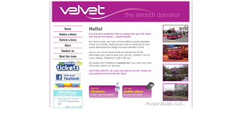
Also by spring 2009 we'd abandoned the Black Velvet Travel name in the public eye - referring to ourselves simply as Velvet - and therefore the black background not only looked bad but was also pointless! So I set about redesigning the site on a white background, which we felt was a marked improvement on the previous version. Indeed, this design served us well for well over eighteen months, and only took retirement this morning! If you can't remember back that far, or you wish to have a play with it for old time's sake, here it is!
However, it is now over a year since we started imposing the Martyn Cornwall-inspired 'look and feel' to our various corporate manifestations, and the website badly needed bringing into line. The trouble is that with lots of competing priorities for time and money, a good website remains as having the potential to be a big ticket cost item.
I can't hope to carry on producing 'home made' websites forever. After all, the business now punches at a much higher weight (I hope) in all other areas of our branding so it is important that it looks right and functions well and my knowledge of html, Javascript and PHP remains at a fairly low level. I certainly cannot even begin to compare myself with professional web developers. Moreover, we have high hopes for a website that has a really classy look and superb functionality, and that is certainly in the melting pot for 2011, working with new design partners to take us to the next level!
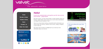
However this may take months to develop and in the meantime the website we had until today was starting to fall badly out of step with the corporate image being applied with increasing consistency across the rest of our world. So, in what I am sure will be my final fling, I decided to 'take the bull by the horns' and bring the site up to date. The consensus so far is that the new look is a further improvement. Obviously it matters to us that it now has a style more in keeping with our other publicity, but generally we feel it looks better and sharper.
There are still some improvements to be made, but this is hopefully a makeover that will last us until we are ready to take the next step. Any comments, insights or suggestions are of course welcome, but I hope you would agree that it's not bad for a website still entirely hard coded, by me, in Notepad on my computer. Apart from a few graphics images bought from royalty-free internet sites, all the graphical elements are produced with nothing more sophisticated than Microsoft Paint!
So if you haven't seen our latest home made website, feel free to take a look!
But as always, reality intervenes, and now I'm off to the yard to park up some buses!
A real insight into the world of launching a start up bus company onto the unsuspecting Joe Public. I must admit that I like the look of the early Black Velvet pages with the black background, but can also see that the new pages have an uncluttered contemporary feel to them.
ReplyDeleteWhilst I appreciate what you say about creating a common image across fleet, publicity, website etc. surely the primary aim has to be to pass current, up-to-date information on to your passengers and (more importantly still) potential passengers.
Many Velvet stops have had faded timetable and fare information for some months now, so I hope you are able to address this issue next.
I agree with your comment about the primary aim being to pass current, up-to-date information, but I would argue that this is all part of creating a strong brand and managing it well - not in competition with it as you perhaps imply.
ReplyDeleteMy opinion is that people are more likely to recognise such information as being valid, more likely to believe in it and of itself it is easier to manage if it is part of a consistent brand style.
As I implied in my post, we have been progressively rolling out our brand style across the various media. The website was a big outstanding area to be tackled and bus stop publicity is now the next outstanding area.
(Though I would argue that this is largely a matter of presentation rather than content as the information contained in our displays is at least good or better than most you will find.)
The intention had been to tackle the roadside displays when we had the inevitable autumn timetable change. In the end however, much to our own surprise, we didn't actually need a timetable change and have none planned either!
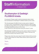
The only exception is on the S2 where there was a change in August, and as a result the bus stop displays are indeed now in the correct style.
The rest will now be tackled as a priority over the next few months and you are right to raise it as a key issue. We need to eliminate the curse of the white sticky label!!!
Hi, nice blog & good post. You have beautifully maintained it,Its really helpful for me, hope u have a wonderful day & awaiting for more new post. Keep Blogging! I have a Web Hosting package related blog/site.web hosting provider
ReplyDelete